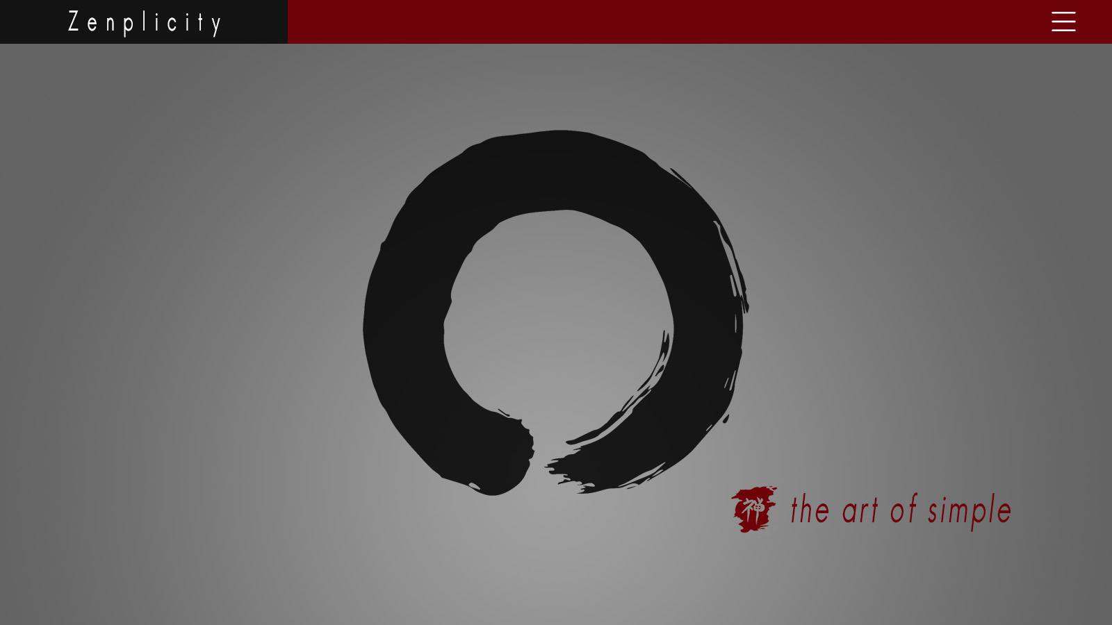
Zenplicity – Allowing Your Landing Page to Breathe

Every once in a while, I stumble across a website that brings about a pause, and a “Wow, I love this!” Most often, what evokes that response is not so much a something as it is a nothing. Emptiness. The roots of Zen.
For years, I have murmured about the compression of landing page content, an approach many companies feel is absolutely obligatory for success. In essence, the desire to tell the world everything they do, in one chunk of binary real estate, accented with big things, bold things, button things, boxy things, colored things, linky things, video things, all intended to make everything stand out, when, in reality, the result is quite the opposite.
BREATHING
Just yesterday, I wanted to get a feel for where the “elite” sports products industry is heading, in terms of site-branding, presentation, and, more specifically, home page population quantity and navigation. I looked at Nike, Adidas, Oakley, Reebok, Ping, Wilson, Nautica, UnderArmour, The North Face, among others, and was heartened to see a trend I have been dreaming of for quite some time. Simplicity! Clarity! Content that breathes.
The most common element within these sites, though not all, is the transition toward a much shallower landing page, sometimes entirely visible on one screen only. To be wholly effective, a few other things need to happen: A refined message with carefully tailored imagery; main menu links reserved for only the most desired pages; links to routine content (about, contact, terms, board of directors, news, etc.) being moved into the footer area only; quick-links in the footer to those same vital product pages.
When you think about it, this follows the natural progression of browsing-to-buy: Go to site – quickly confirm whether or not the site offers what is being sought – find a dealer or direct-purchase – read more detailed information or contact the company, if necessary. One only needs to scroll (or swipe) down once or twice to be greeted with a wide array of well-organized, relevant footer links to go anywhere they wish, without having to weed through tons of text and pictures and colors and buttons to get there. I often find a well-designed footer to be much more efficient than a main menu, since it negates drop-down navigation and extra clicking or poking, especially on mobile devices.
One other option to consider is the growing trend of using a mobile “hamburger icon” in your header menu vs. spelling out each menu item individually. This does mean 2 clicks to get somewhere, but greatly cleans up the welcoming visuals.
THE ONE THING
The biggest hurdle in achieving “Zenplicity” — the balance of unhindered impact versus maintaining ease-of-navigation and an effective, captivating message — is to ensure that your overall brand has been clarified into a bite-sized tidbit. With mobile devices rapidly becoming the more prominent conduit between your brand and your success, it’s critical to present your content in such a way that it is interpreted, understood, and retained, in a matter of seconds. Not everything, just THE thing… the one thing you offer that lets them know they are in the right place, and that you are a credible source for it. No matter what it is that you do, you should be able to convey it in one sentence:

Our Custom Rockets Bring You Home Safely

You Probably Won’t Be Audited with Our Tax Service

The Lowest Prices on 99% Waterproof Submarines
Now, take that sentence and create an image that perfectly encapsulates your message. This one image, which links directly to your store, service, or whatever it is you do best, might just be all you need in the body of your landing page, probably accompanied by “the sentence“, for both clarity and SEO* purposes. For example, take a look at slack.com, or Adidas.com (though “sliders” can also come with a penalty).
Also, keep in mind that many of your visitors are likely sitting at a stoplight (green, no doubt) on the way to work, or at work, or surrounded by noise, music or just general environmental clutter. If conveying your message is important, adding to that clutter is the last thing you want to do. In the simplest terms, it’s not so much what to do as what not to do:
- Don’t be the affable grandpa who slowly explains how and why and when clocks were invented, when asked what time it is (we love you, grandpa!). Keep it clean, to-the-point, and easy to navigate.
- Don’t be timid about allowing the user to find and click a link in the footer or menu area to access more detailed information, versus spelling it all out in tons of images and text on the main page.
- Don’t be afraid to put a brief, company overview and contact details into the footer–this is an SEO friendly area when done properly. However, the overview is something I actually prefer up near the top, since it does contribute to “the message” and overall SEO results.
- Don’t ignore your brand. Clarify it, in a way that can be conveyed with a short, explanatory tagline, accompanied by a single, intriguing image, which links to the most important area of your site. Be cautious about staying within your brand colors, or lighter/darker shades thereof. Too many off-hues can rapidly equate to cluttervision, and possibly seizures.
- With few exceptions, don’t use your smartphone for site imagery! There are hundreds of superb stock media sites available now, with countless world-class images selling for $1 each. Even better, if your marketing budget allows, hire a professional photographer to custom-tailor all imagery to perfectly match your brand. One extremely powerful image can far outweigh a dozen irrelevant or mediocre images, and help keep content-bloat under control.
- Don’t get carried away with many multiples of big, bulky boxes and unnecessary links and sections on your landing page. Most people are now very adept at quickly finding what they need, if the links are easily accessible in the menu or footer.
While this approach is primarily focused on keeping the main landing page clutter-free, consider putting the rest of your site on a crash-diet, as well: Delete those unneeded, interior pages (like “Al’s 2003 Company Picnic Review”); carefully review and thin-down superfluous content; make sure your imagery is top-notch, relevant, and just-enough to be a contribution, not a distraction; lather, rinse, repeat in a few months. These simple things can help keep the viewer focused, and on-mission. The added benefit is that search engines will routinely yield better rankings for sites with content that changes on a regular basis.
Unless you are a dedicated news source, blog or article-based service where instant content volume IS the product, try experimenting with the ever-elusive “stark”… the always-appealing “clean”… and the absolutely-vital “clear” to enhance the impact of your landing page, and message. Embrace the white space. Let it breathe. Choose your images carefully, and make sure that they are professionally composed. The less your content competes with itself, the better that message will be retained. Again, simplicity rules.
*SEO stands for Search Engine Optimization which refers to strategies and techniques to increase the number of visitors to a website by obtaining a high-ranking placement in the search results page of a search engine — including Google, Bing, Yahoo and other search engines.
Derek Choice
Sr. Digital Designer, ZBglobal, Inc.
Derek Choice is a life-long musician, artist, videographer, editor, shakuhachi maker & entrepreneur. He founded rhythmlakeMEDIA, Funk Logic, North County Flying Machines and reflectivebackdrops.com, and is presently Sr. Digital Designer at ZBglobal, Inc.
